
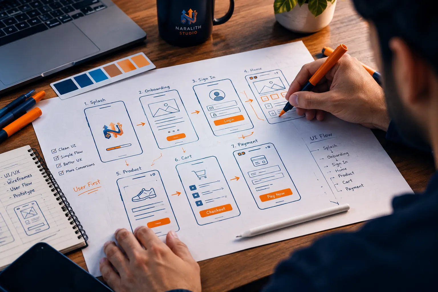
Turn complex ideas into interfaces people actually enjoy using.
A confusing product loses customers before they even get to your pricing page. We combine real user research with clean, deliberate visual design to build interfaces that are easy to use — and easy to trust.
Modern, Scalable Design
Reusable components and clean design tokens, handed off in a format any developer can build from.
What's included
No vague deliverables — here's exactly what you get when you work with us on UI/UX.
User-Centered Research
We start by understanding your actual users — their goals, friction points, and behavior — before a single pixel is drawn.
Wireframes & User Flows
Every screen is mapped out logically first, so navigation feels obvious and nothing gets built on guesswork.
High-Fidelity UI Design
Pixel-perfect visual design, typography, and layout hierarchy — built to convert visitors into customers, not just look nice.
Interactive Prototypes
Clickable Figma prototypes so you can test and approve the full user journey before we write a single line of code.
Design Systems
Reusable components, color tokens, and style guides — so your product stays visually consistent as it grows.
Handoff & Dev Support
Developer-ready specs and assets, plus direct support during build so nothing gets lost in translation.
Choose your package
Transparent pricing, fixed delivery days, written scope — no hidden charges.
Basic
PKR 30,000
one-time project fee
- 3–5 Screens designed for both desktop and mobile (Responsive layout)
- Low-fidelity wireframes reviewed before high-fidelity visual design
- Core design basics (Colors, typography, buttons, inputs, spacing grid)
- Edge cases covered (Empty, loading, error, and success states)
- WCAG AA accessible — Proper contrast and touch/tap target sizing
- Organized Figma file with auto-layout and exportable assets
- Up to 2 revision rounds included
Standard
PKR 50,000
one-time project fee
- 12–20 Screens designed across desktop, tablet, and mobile
- Competitor UX audit, user personas, journey mapping & IA structure
- Full Figma component library with states (Hover, active, disabled, error)
- Clickable interactive prototype + 1-hour developer walkthrough call
- Up to 3 revision rounds across project phases
- Micro-interactions & motion specs delivered as Lottie files
- Tailwind CSS theme tokens export ready for developers
Premium
PKR 100,000
one-time project OR PKR 20,000/month ongoing design partner
- 30+ Screens across web, iOS, and Android (Platform-native HIG & Material guidelines)
- Discovery workshop + Moderated user testing session feedback
- Production-grade design system (Figma variables, design tokens & UI Kit)
- Full accessibility compliance audit & developer-ready tokens export
- Post-handoff Design QA (Checking coded build against Figma design)
- Dedicated senior UI/UX designer with priority revisions
How we work
A clear process, start to finish — so you always know what's happening next.
Discovery Call
We learn about your business, users, and goals — no cost, no obligation.
Wireframes
Low-fidelity structure first, so we agree on layout before visual design begins.
Visual Design
Full UI design in your brand colors, ready to review in Figma.
Handoff
Clean, developer-ready files — or we build it ourselves, end to end.
Frequently asked questions
Straight answers to what clients actually ask before starting.
Ready to redesign your product's interface?
Let's build a clean, human-centered UI/UX that earns your users' trust — and holds up as your product grows.